Diana Springer Logo Project
The Challenge
Diana Springer is a therapist who offers a safe and judgment-free space to women who feel unseen, unheard, or disconnected. Her mission is to support all women navigating life and its transitions, especially those who may be making themselves small, apologizing for their needs, or struggling to live by their own values.
The logo needs to represent a sense of freedom and clarity without relying on imagery such as brains, heads, knots, strings, and other typical therapy images.
The logo needs to also feel warm and approachable.
The Solution
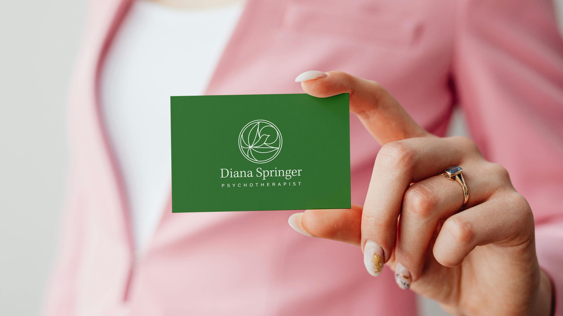
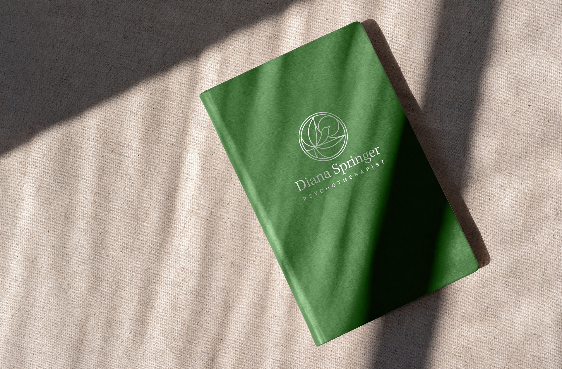
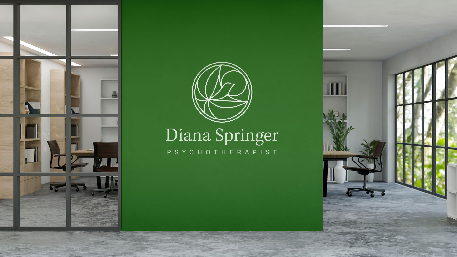
I created a logo of an abstracted bird flying into the sun. The composition of the bird and sun was chosen to represent the symbols of freedom and warmth. The icon was rendered as strokes to give it a sense of levity and transparency; two very important ideas in therapy.
A serif font was chosen for the primary wordmark because it feels familiar, and is associtated with expertise and professionalism. It also balances the modernity of the icon.

Draft
This draft was created to explore Diana's certification in perinatal mental health such as infertility, pregnancy, and postpartum life. We moved away from the pregancy imagery to make Diana's practice feel more inclusive.
A Deeper Analysis
Hover or click over the teal ripples to read about the different parts of the logo.
Hope and Possibility
Serif Font
San Serif Font
Color Choices
Deep Green
Deep green is commonly associated with growth, stability, sophistication, and nature. Because it’s more muted than bright green, it tends to feel more grounded and mature.