Brand Evolution
The Challenge
Huntington Technology is a 25-year, Managed Services Provider (MSP), serving small to mid-sized businesses. The company has grown steadily through long-term client relationships, referrals, and has a strong reputation for reliability and trust. Marketing execution exists, but lacks a cohesive visual system and a consistent narrative. Huntington approached The Marketing Seat for this project, who then contracted me to it.
The brand needs to reflect a company that is:
- Calm, confident, and experienced
- Business-first, not tech-flashy
- Trusted to “see around corners” for clients
- Focused on long-term partnership, not quick wins
“Total Care” is the core of the Huntington experience, with the brand system supporting:
- A premium, comprehensive feel
- Clear hierarchy between Total Care and supporting services
- Confidence and stability rather than technical complexity
Ultimately, this a brand evolution and not a rebrand.
The Solution: A quick Summary
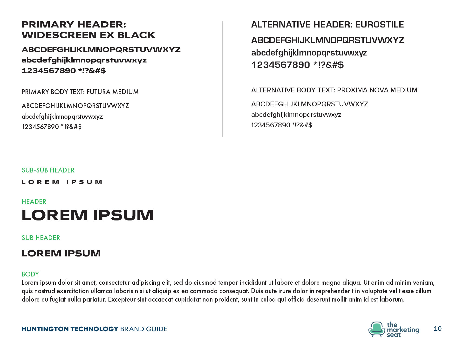
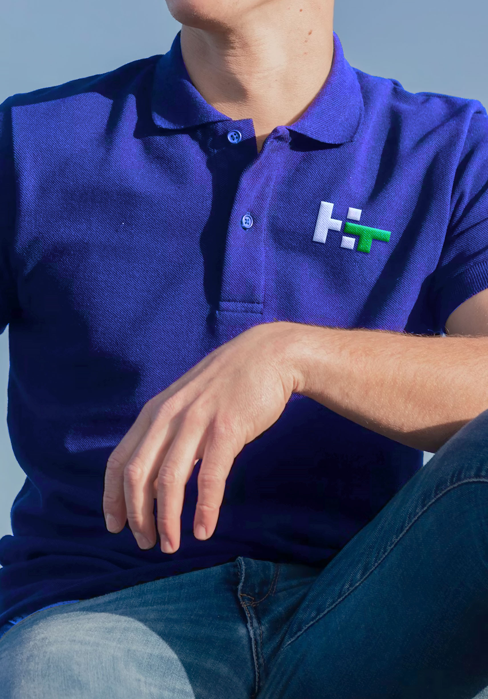
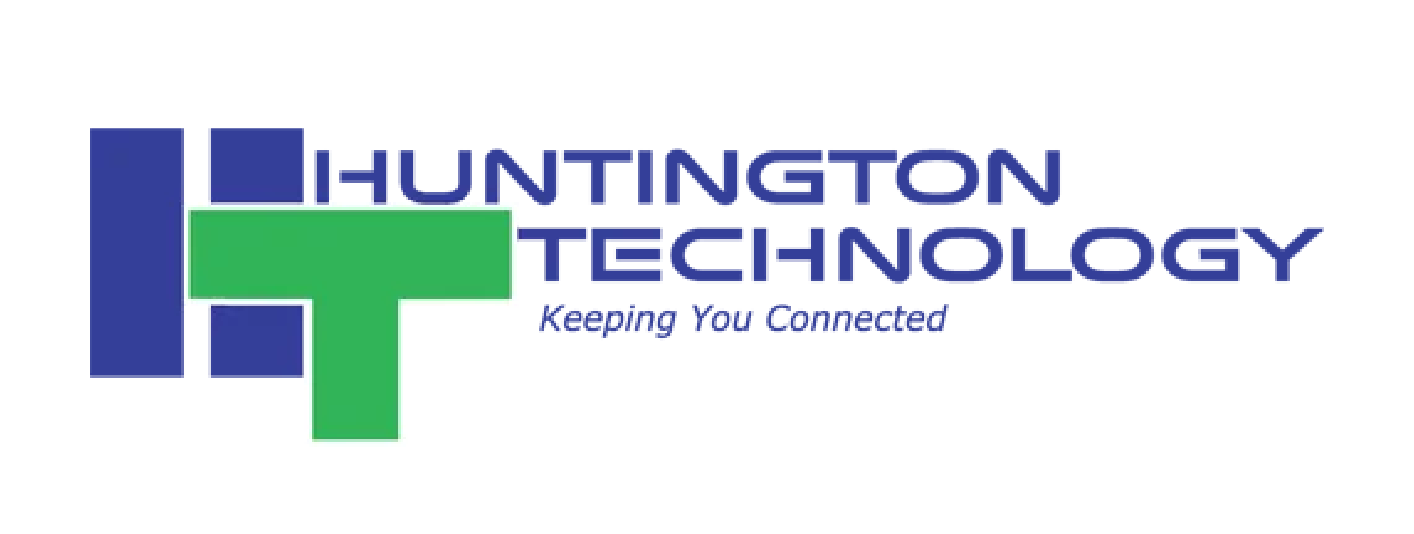
The logo was the first item to recieve attention. The icon got a soft redesign, and was given more negative space in and around the elements. The wordmark needed to retain its "sci-fi" look as directed by the client, but I chose a font that had wider counters for better legibility.
I introduced secondary colors to the brand in order to assign them to different parts of the business. More importantly, I wanted to isolate the green color for the "Total Care" services section because green is the warmer of the two main colors.
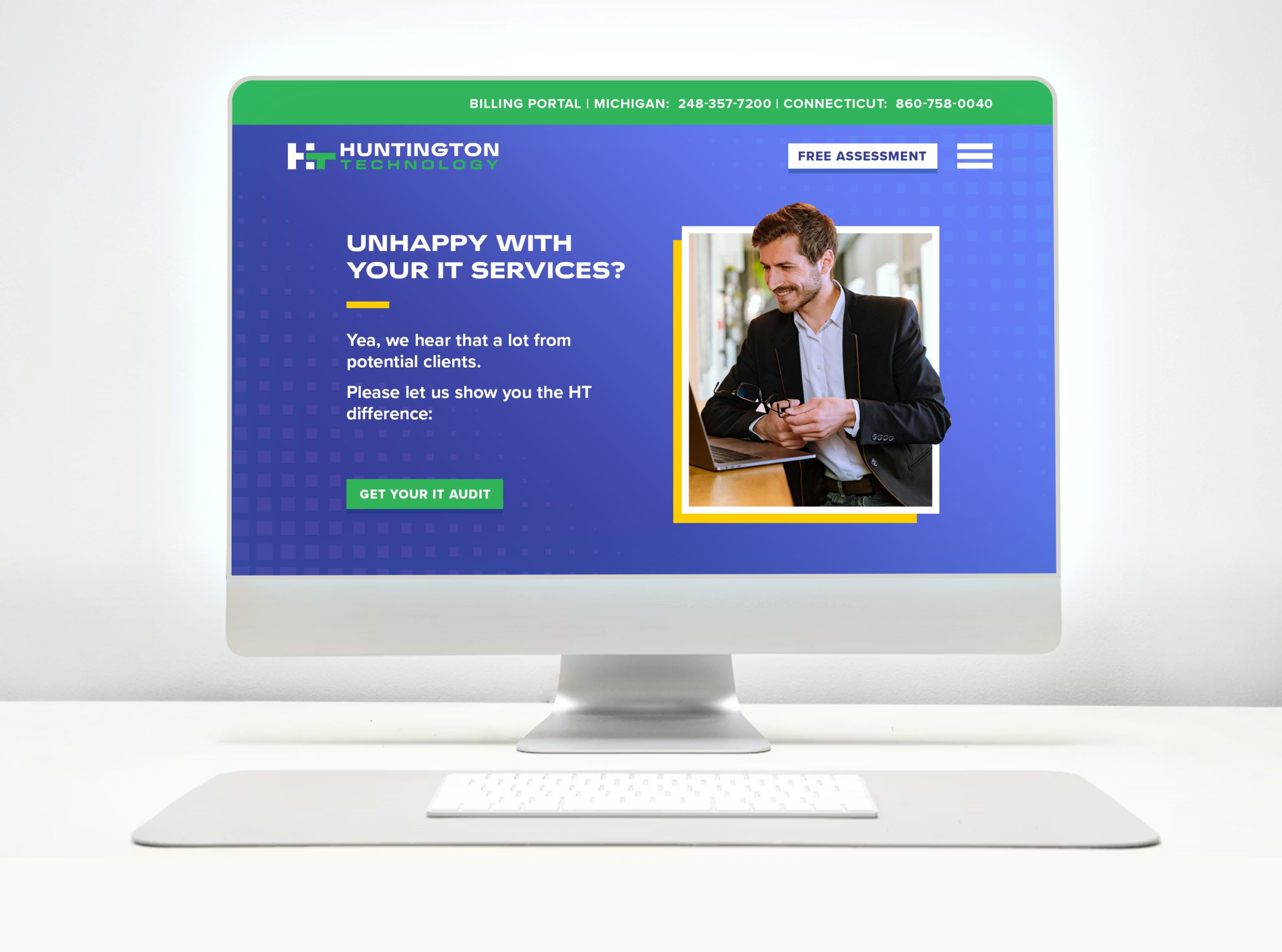
Laslty, I added a gridded background to carry over into most of the branding for consistency.
The Logo
Before
After
care-Focused
When it comes to providing total care and other services, people are the main drivers of that. In this version of the logo, the “H” takes more precedence to emphasize the name of the human(s) providing the technological services.
The wordmark has been changed to Widescreen and New Science to give the logo a more updated look.
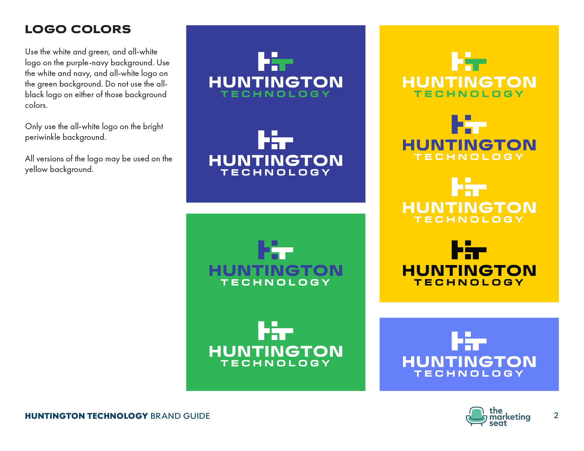
The colors have been kept the same to make it recognizable to existing clients.
See Around the Corners
The interlocking “HT” icon has been reconfigured to allow more negative space. This space is important because it allows the icon to have more scalability when shrunken to smaller sizes. More space was added to give the statement “see around corners” a more literal representation.

Responsiveness
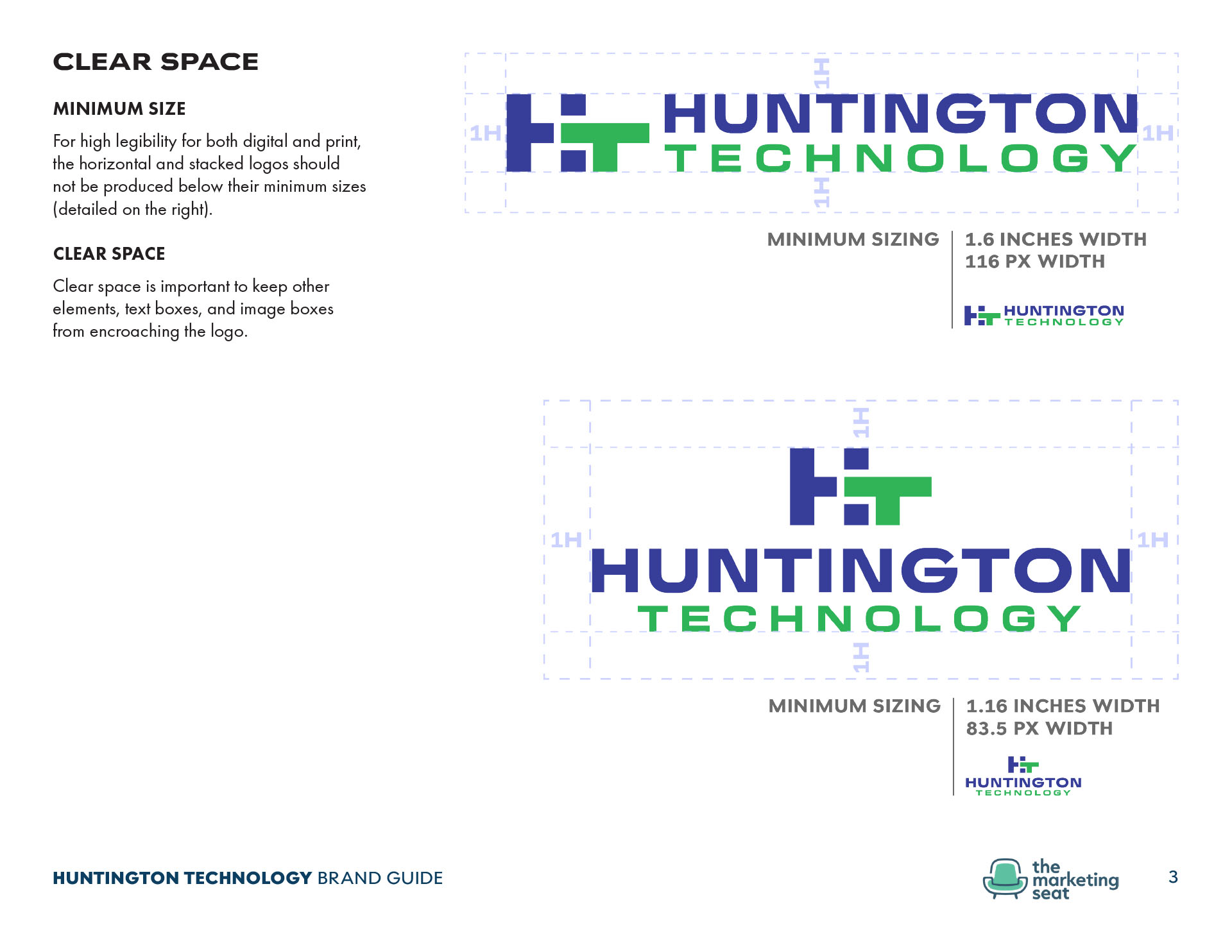
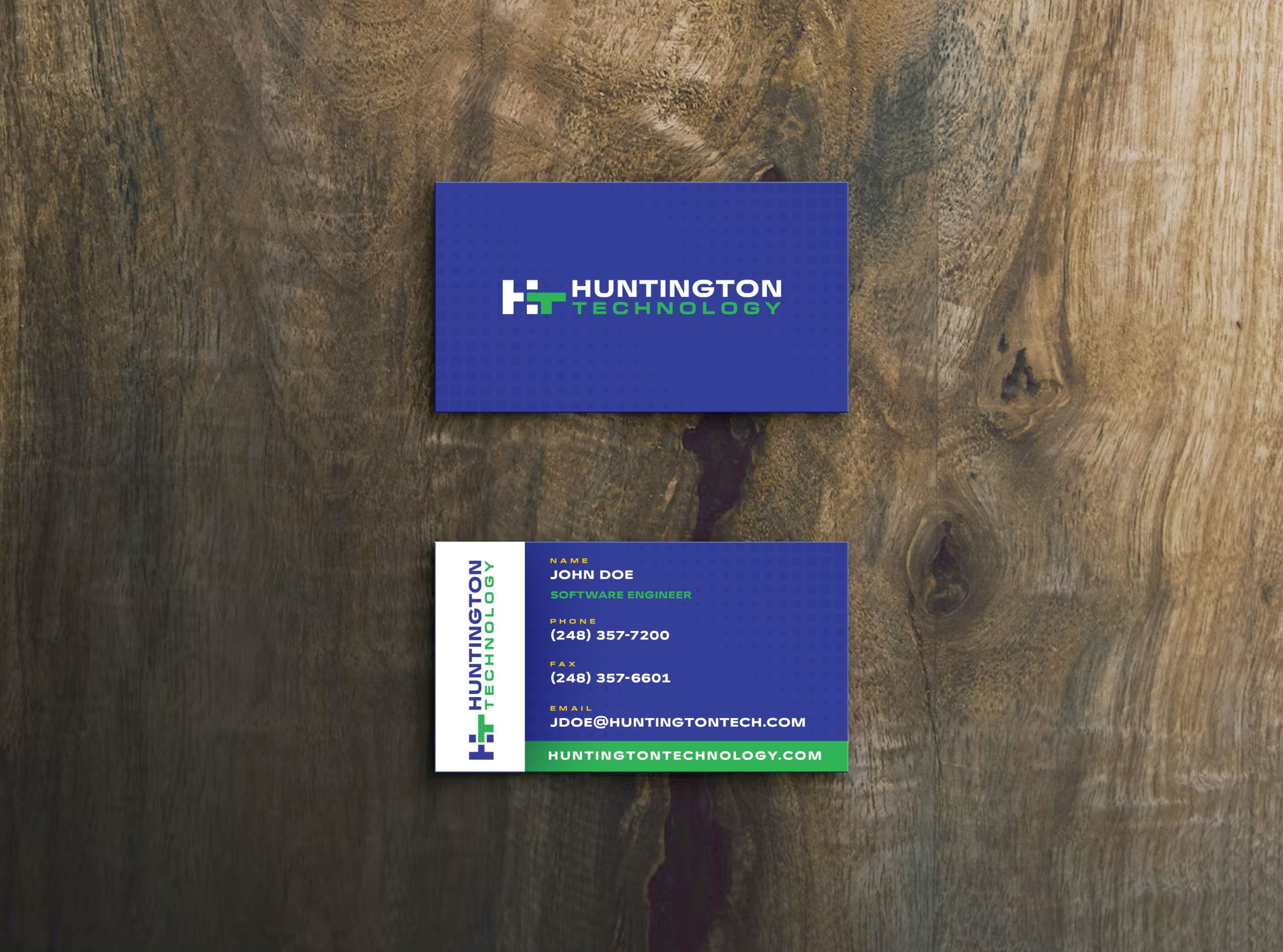
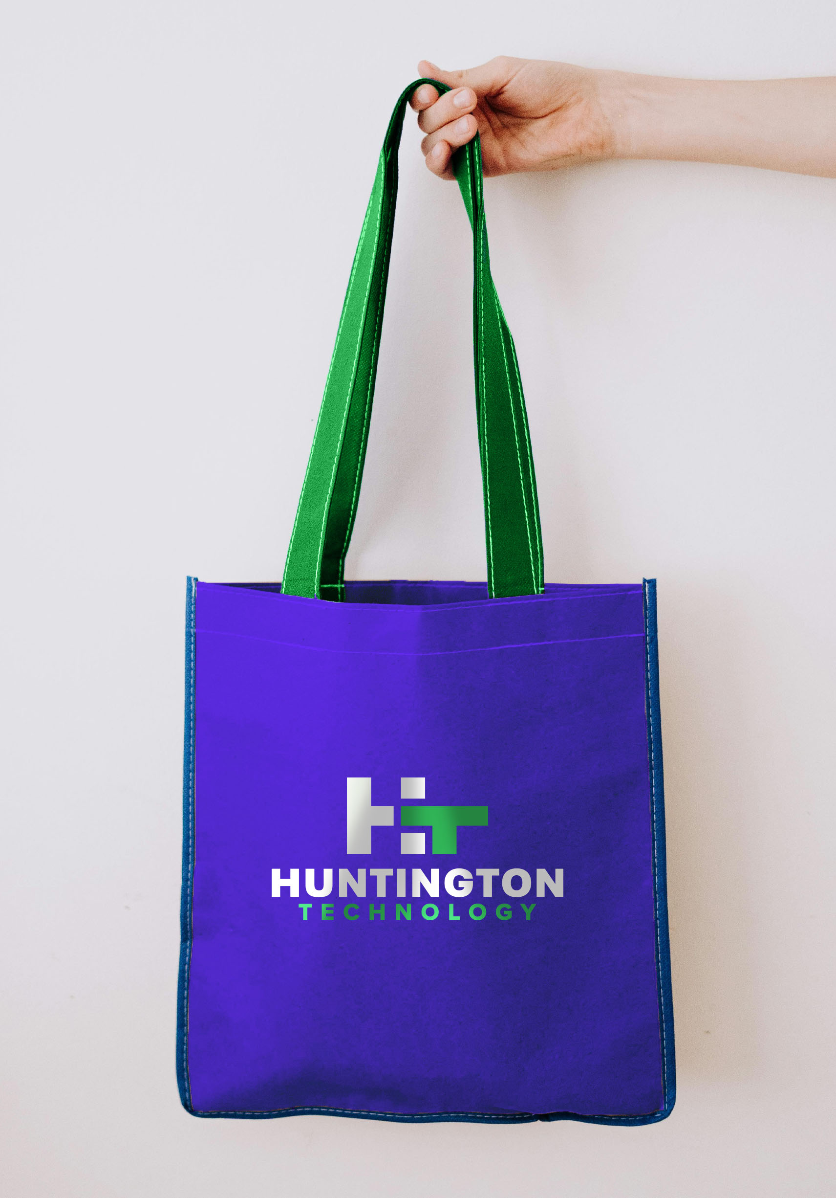
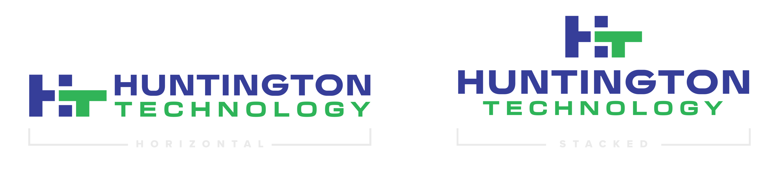
To mirror the icon’s responsiveness, the entire logo now has two configurations to nest itself appropriately into any space. The horizontal logo works best on website headers, social media banners, and business cards. The stacked logo works best on website footers, one-pagers, and letterheads.
Alignment
Manipulating space in logos can be tricky, and takes discipline and experience to let certain parts of the logo breathe. While It is tempting to place the wordmark “Huntington” over the “T” in the icon, the logo should not be treated like a game of Tetris.
Taglines
The tagline in the evolved logo has been removed. While taglines are a good tool to give the brand clarity and personality, it clutters the logo and does not scale well. Taglines can help logos give them context when the logo is not descriptive enough. Having the word “technology” in the wordmark suffices in giving potential clients context as to what your the does.
Even though the tagline has been removed the logo, it can added to the footer of web pages, letterheads, and slides presentations.
Color Palettes
Primary Color Palette

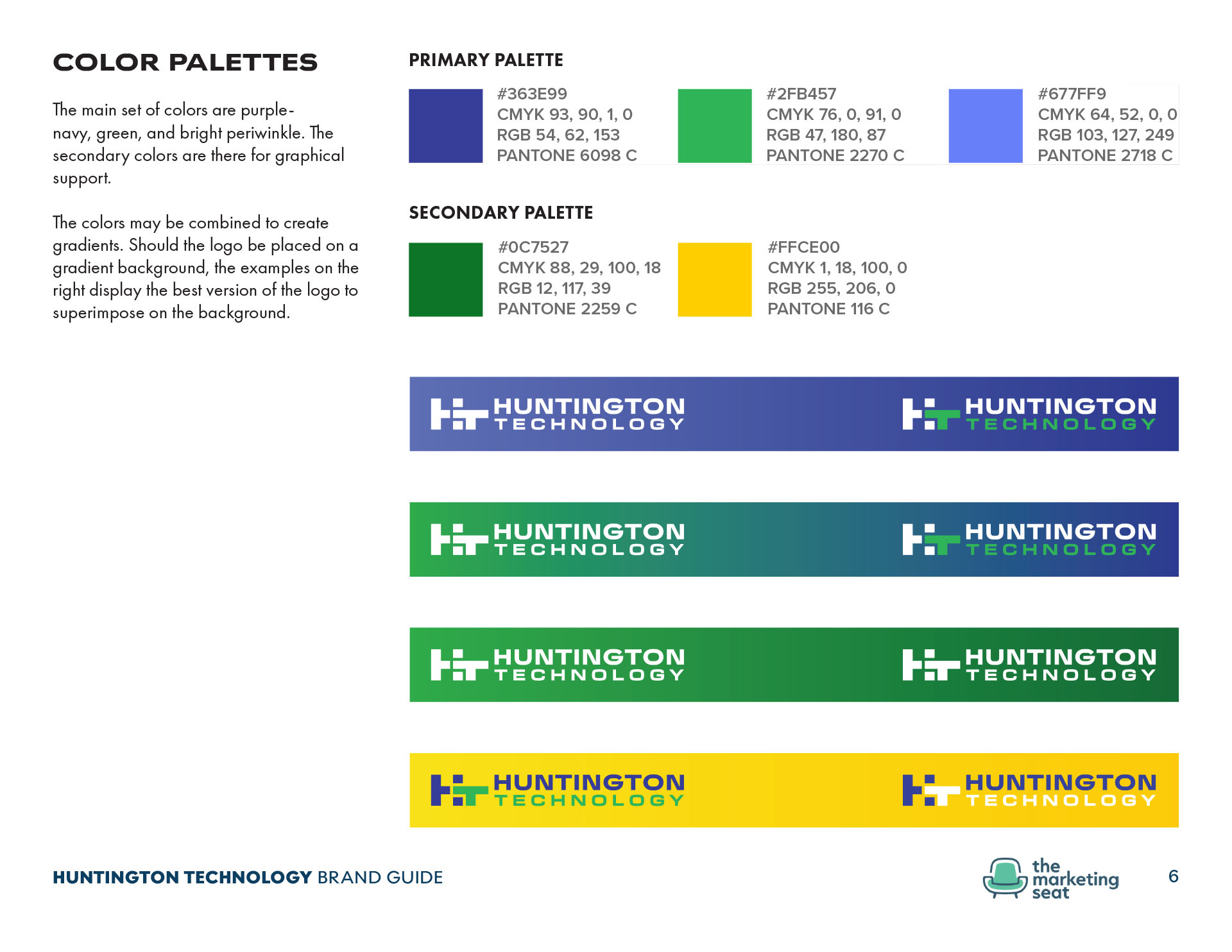
This color palette and accompanying mockups will have navy-purple as the dominant color to evoke a sense of confidence, strength, and trust that is associated with navy. Though many of the Michigan competitors use blue, the advantage of using it in this case is that clients will immediately make the connection that blue and navy are commonly used with technology-based marketing.
The green color can be used to call attention to the “Total Care” services, and the bright periwinkle can be used for supportive services. The bright periwinkle can also offer graphical support for gradients (as seen below) and charts.

The green must never be superimposed over the bright periwinkle to avoid low contrast.

Secondary Color Palette

The secondary color palette introduces the dark green for gradient support, as well as a yellow accent color to be used discreetly to call attention to something, or for sub-sub titles.