Wise Women Logo Project
The Challenge
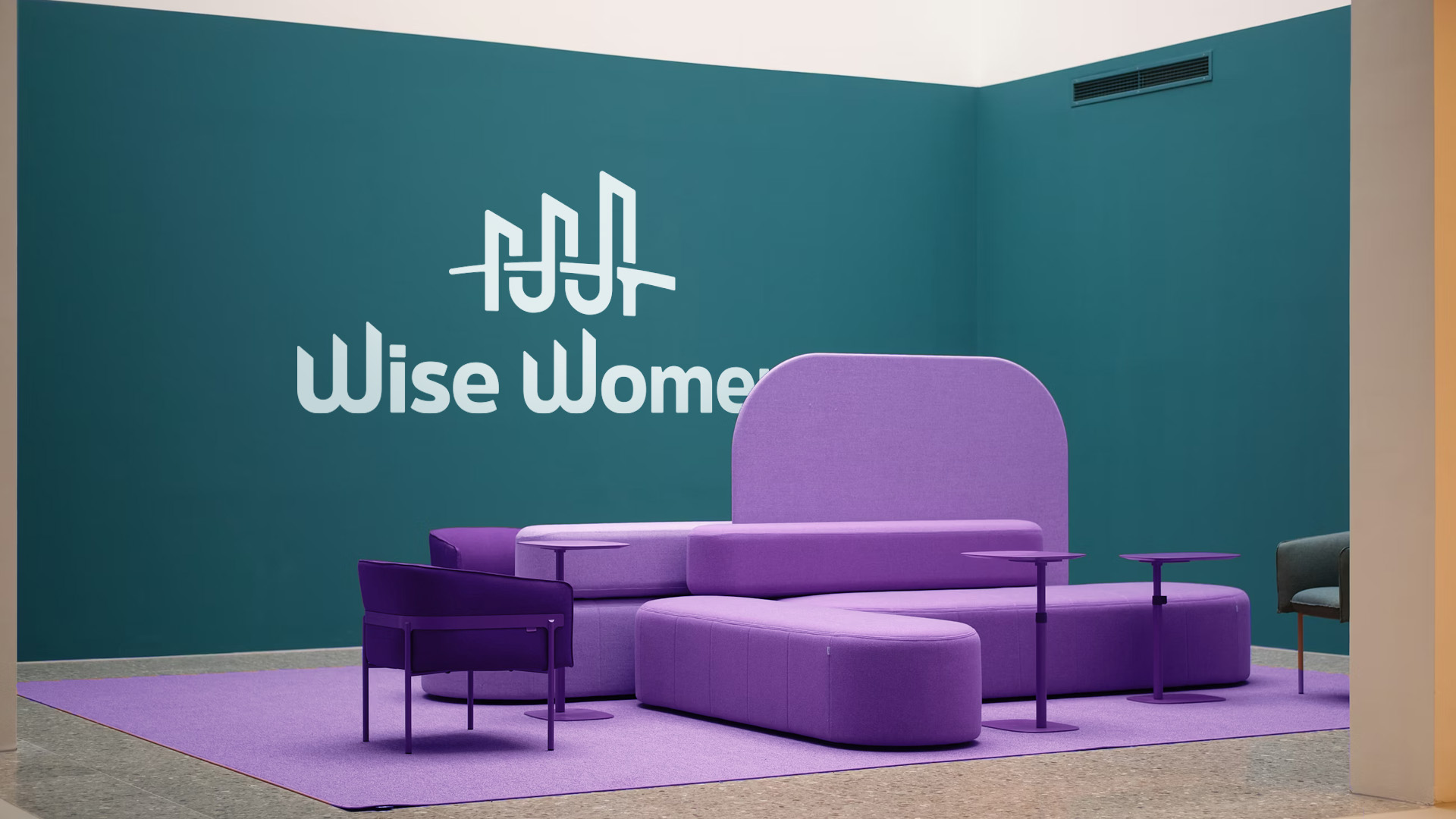
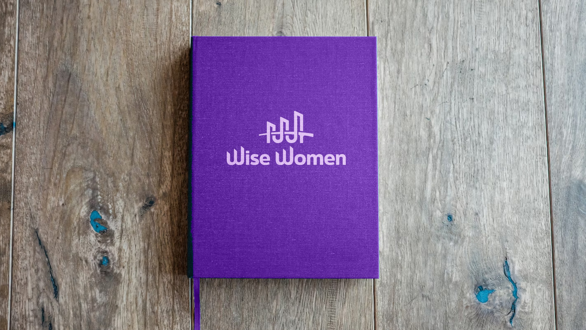
Wise Women is a community for women business coaches. There’s a primary Wise Women brand, and 6+ individual groups within it. They are looking for one logo to encompass all of the groups.
The logo should be warm but not kitschy, supportive but not maternal, feminine but not girly, and lastly, FUN, but not elementary. The brand should emphasize community and togetherness - growing together, learning together, and share a sense that we are stronger as a unit than on our own.
The Solution
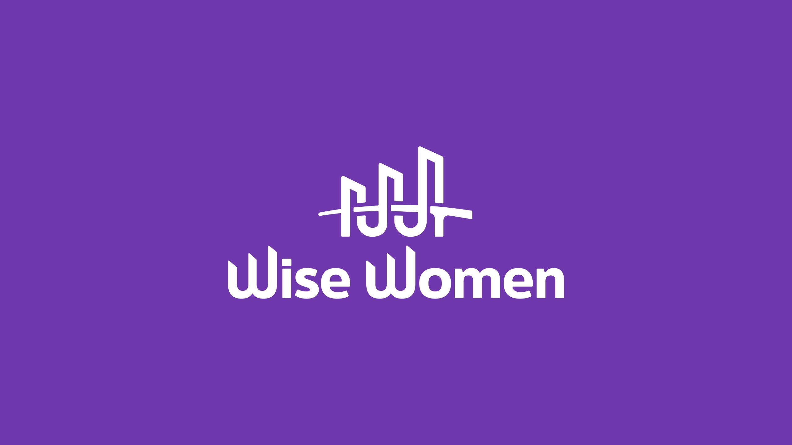
I created a bridge logo because:
- Bridges are physically supportive structures
- They can simultaneously feel feminine, such as the Gateshead Millennium Bridge
- Bridges are effective at communicating connection, or togetherness
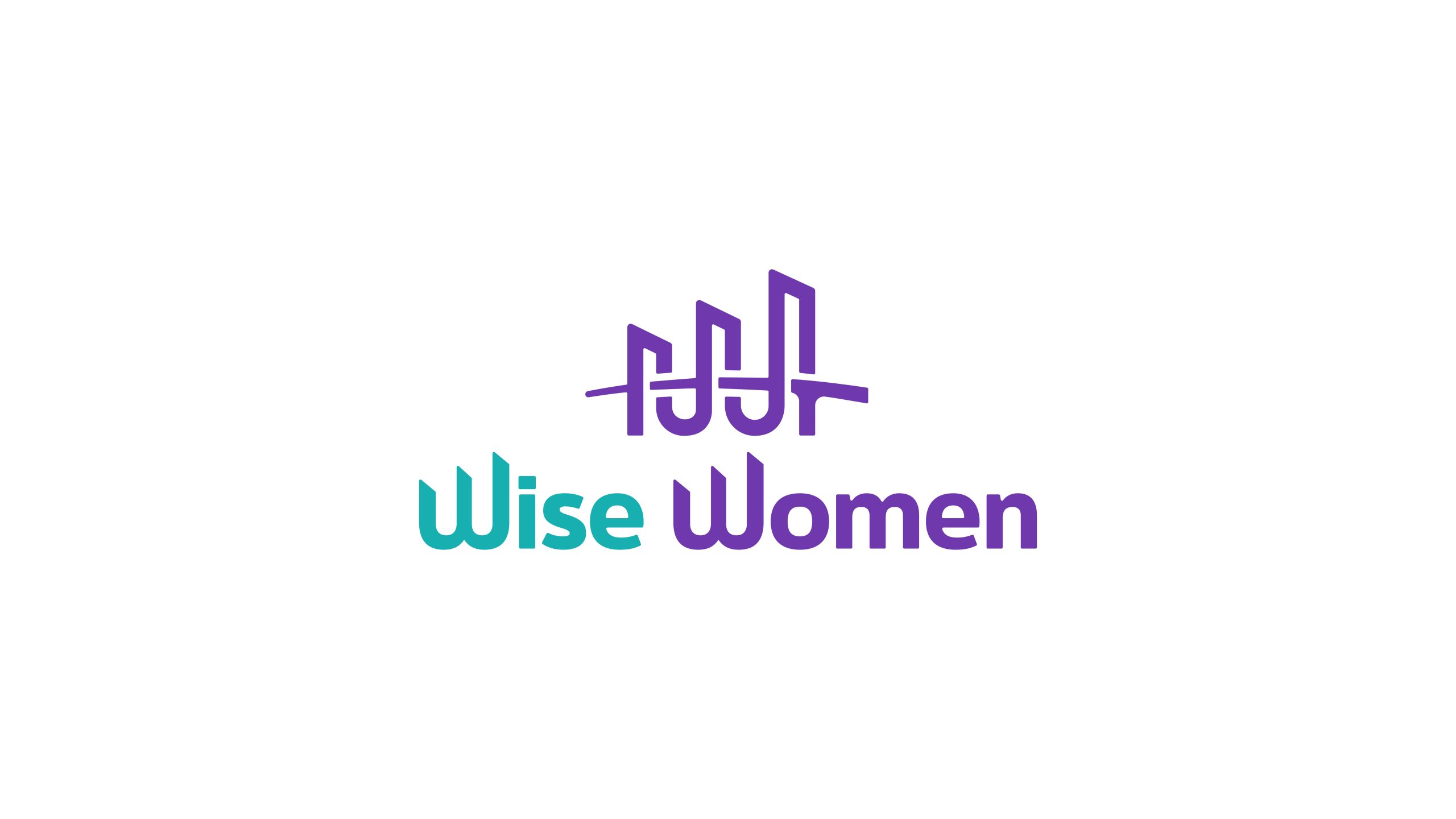
The towers of the bridge are cut into different sections, but together, forms a strong unit. The towers are designed in a way that a "w" is embedded in the structure, which is echoed in the wordmark to emphasize the logo's cohesion.
Lastly, the wordmark has slightly rounded corners to soften the harshness of the characters.

Draft 1
This draft was created to explore the concepts of accomplishment, growth, and strength of conquering the metaphorical mountain that's embedded in the negative space of the overlapping W's.
Draft 2
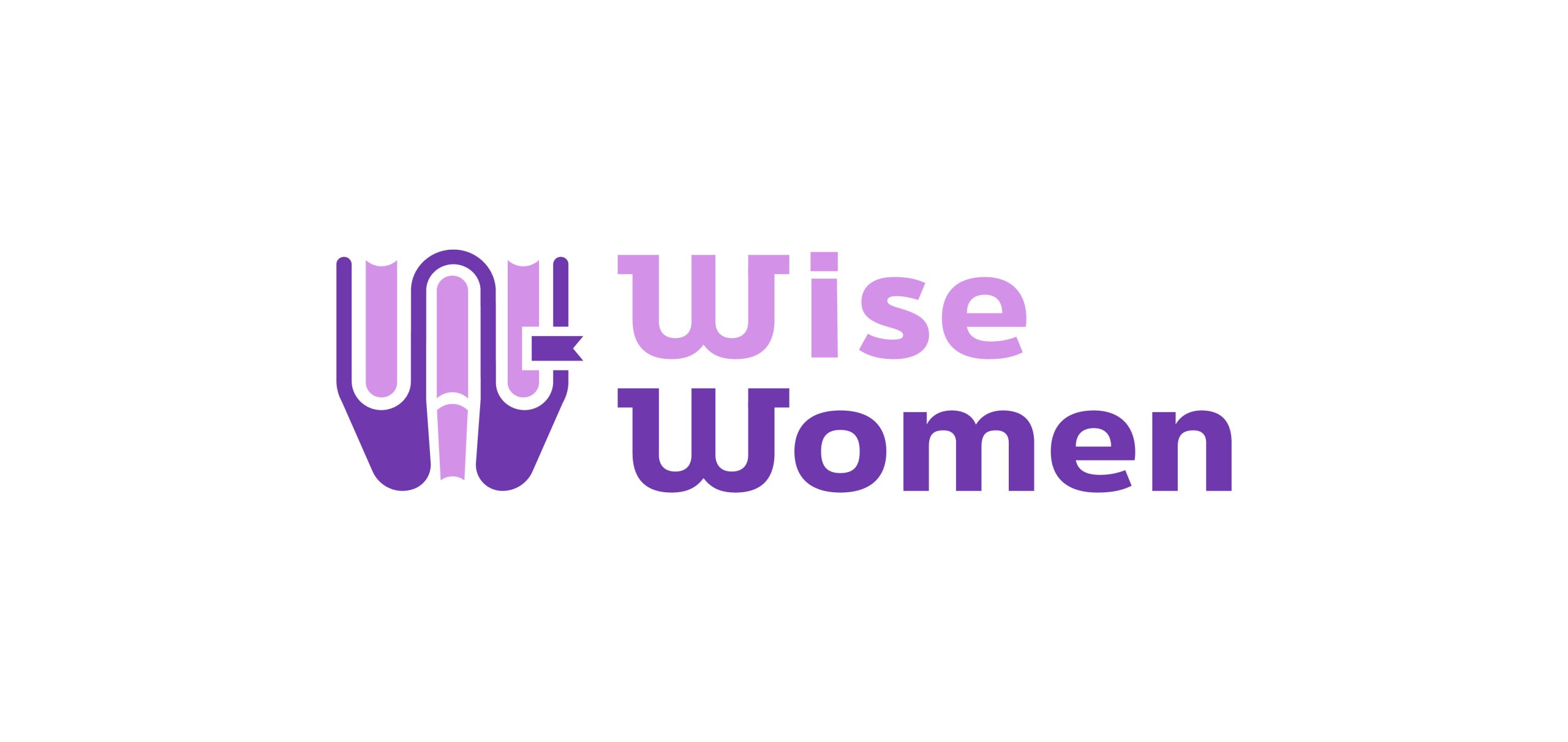
This draft was created to explore the concepts of knowledge, learning, and wisdom that are exemplified in the w-shaped book icon. I added serifs to the W's in the wordmark to mirror serif fonts commonly found in books.
A Deeper Analysis
Hover or click over the teal ripples to read about the different parts of the logo.
The "W" Icon
The "W" Icon
Balance
Color Choices
Purple
Purple can symbolize introspection, mystery, wisdom, and spirituality.
In branding specifically, purple is often used by companies that want to feel:
- Premium
- Imaginative
- Strategic
- Modern
- Unconventional
It’s a strong choice when a brand wants to balance professionalism with creativity.
Teal
Teal represents creativity and communication. It can suggest open-mindedness, thoughtful expression, and innovation.
The bright teal is energetic and fresh, while feeling professional because of its proximity to blue.