Brand Realignment
The Challenge
Intricon, a company that specializes in precision miniature molding, microelectronics, and electromagnetic navigation technologies, tasked Media Bridge to realign their brand. The realignment was driven for a few reasons: their branding needed to reflect their current focus of miniature electronics, the old branding relied on outdated imagery, and the branding needed to feel more unified. Media Bridge contracted me for this task.
The Solution
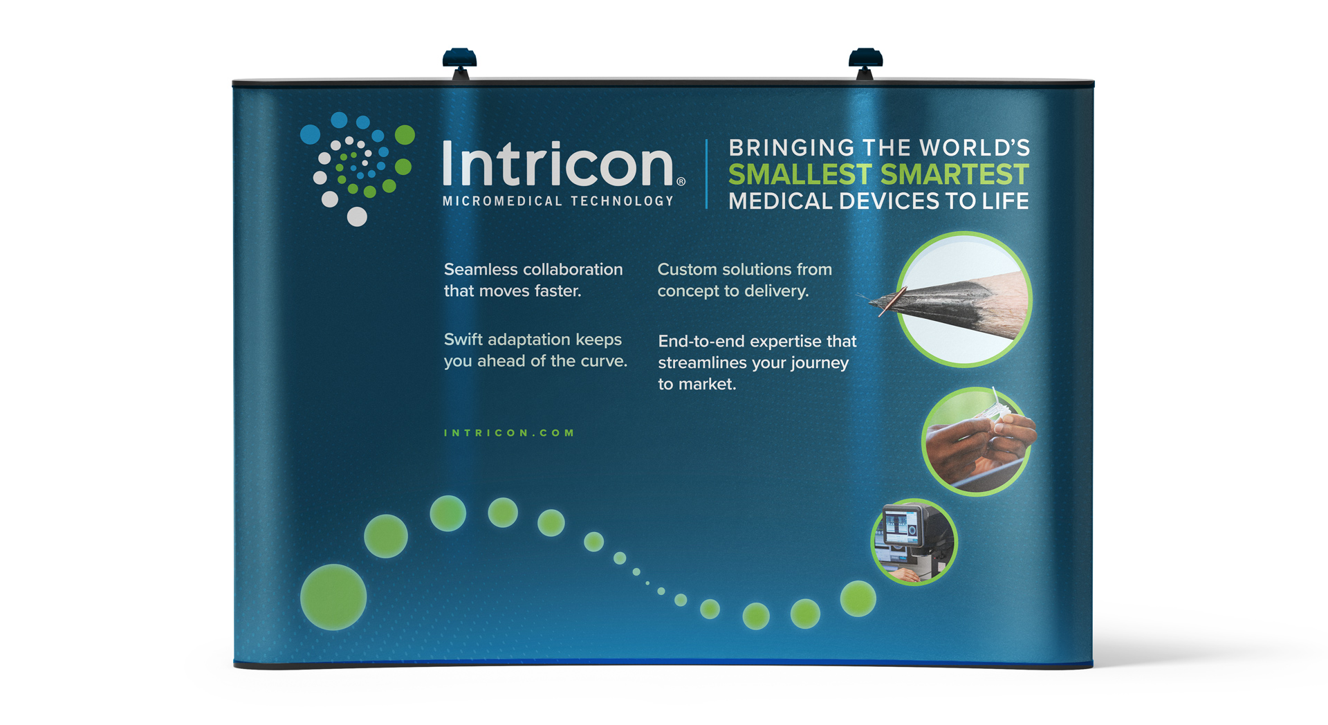
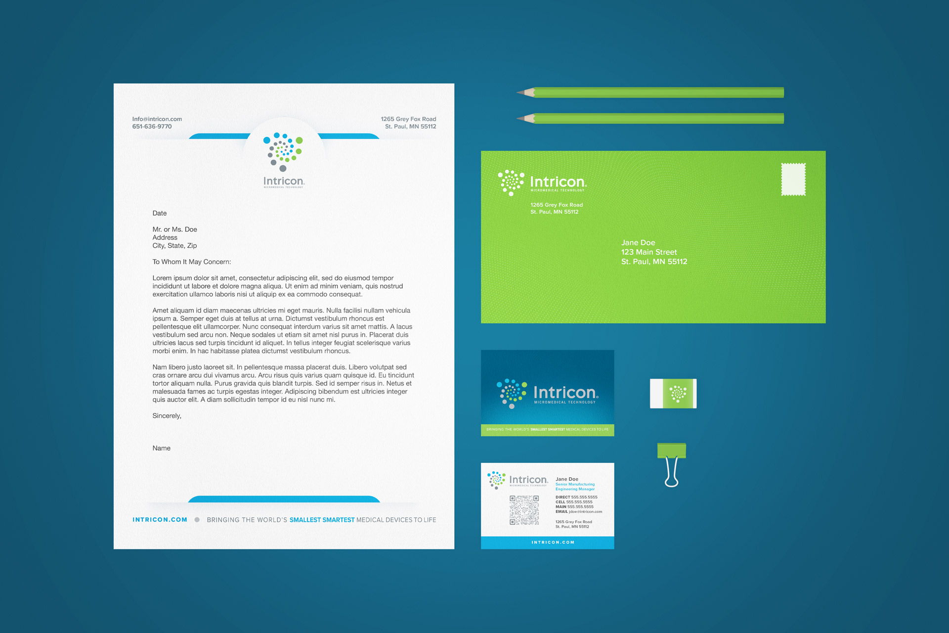
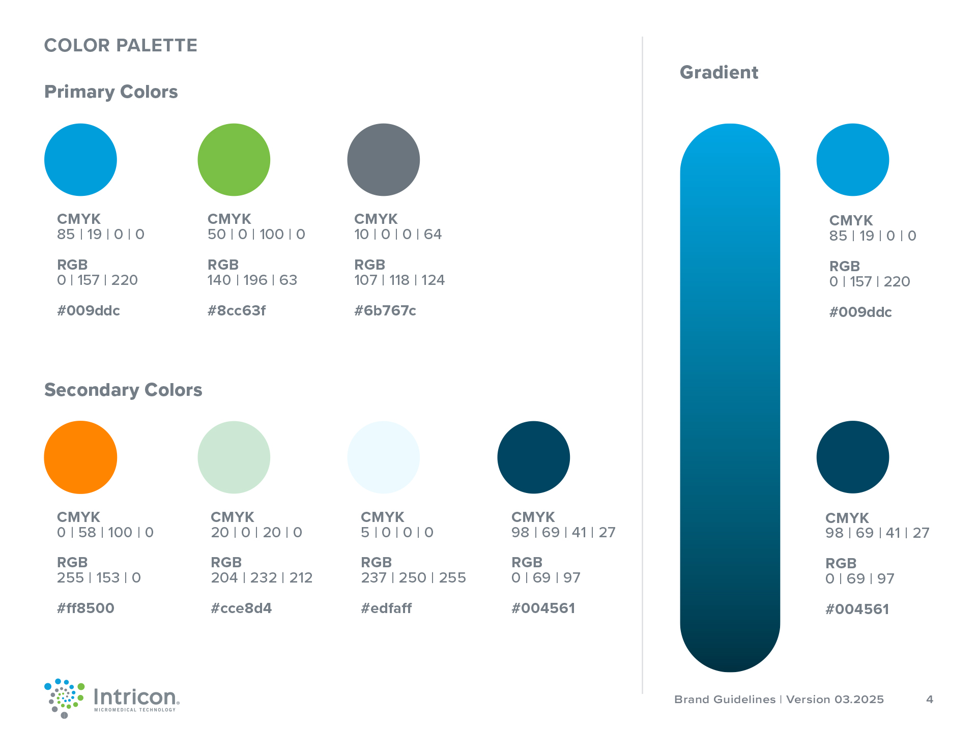
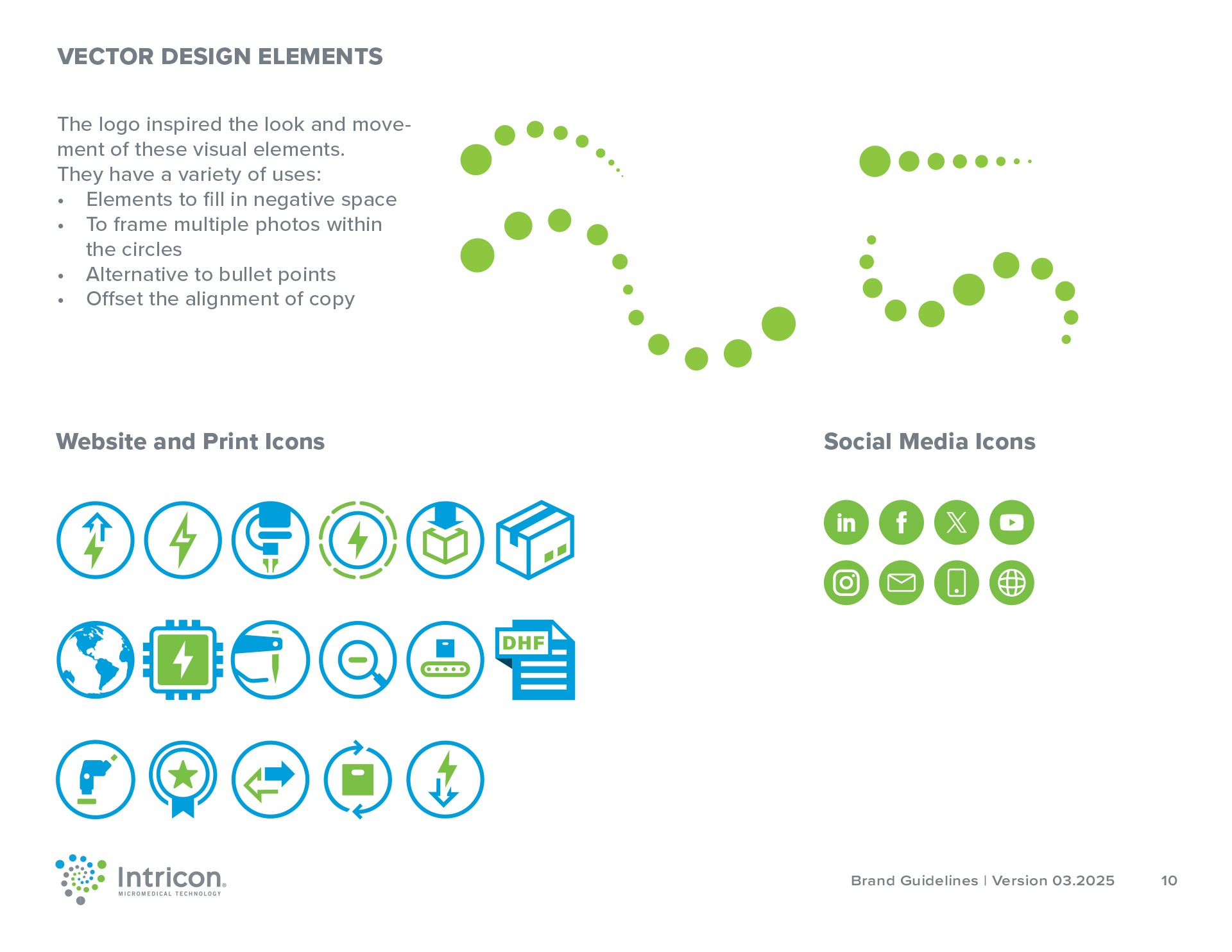
I used their logo as an anchor point for their digital and print assets. Their logo has a lot of movement, and I carried that movement into their flyer and large display pieces. I then highlighted images of their miniatures, capabilities, and processes in the redesign of their website and slide deck template. Because of how niche their business is, I created custom icons to reflect their products and machinery. Lastly, all of my recommendations were condensed into a revised brand guide.
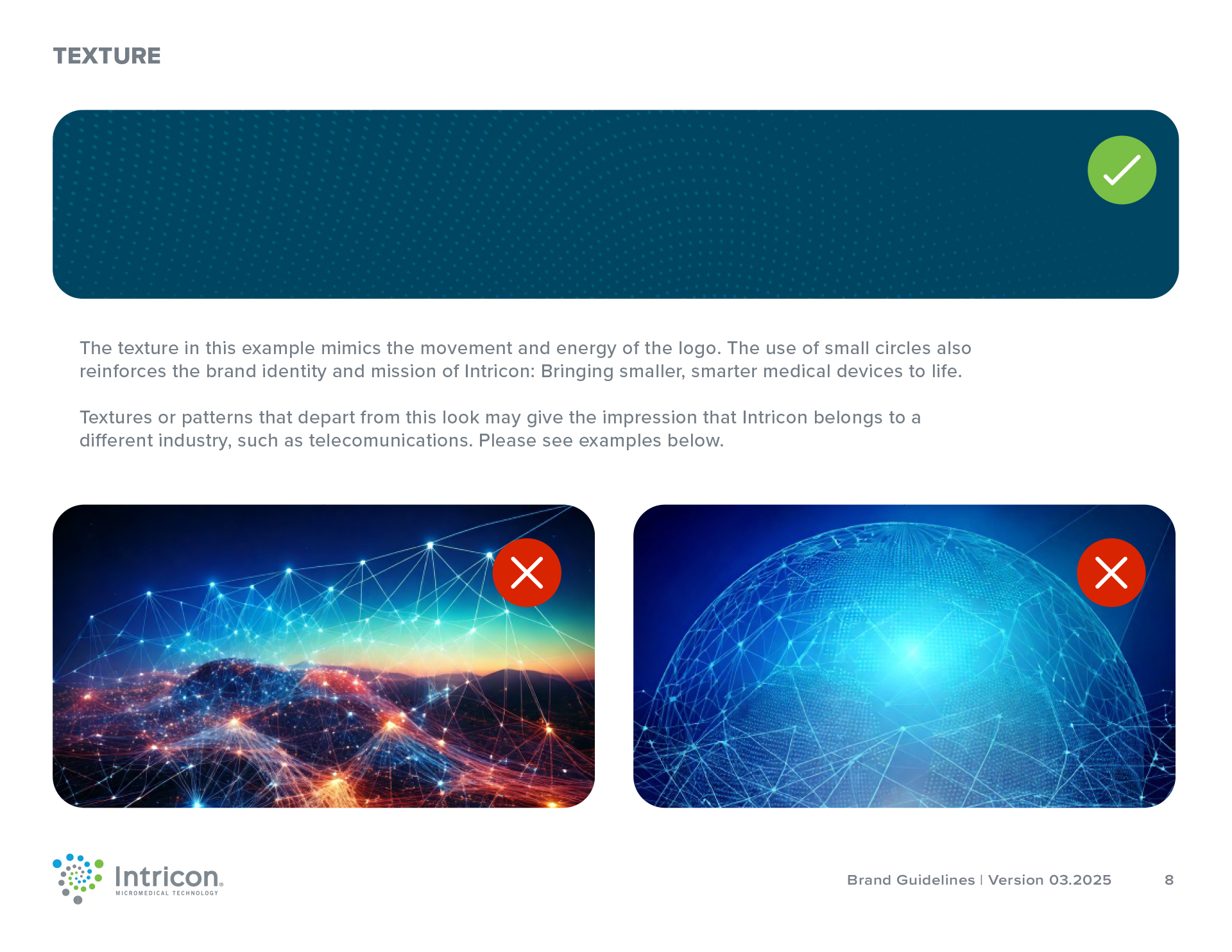
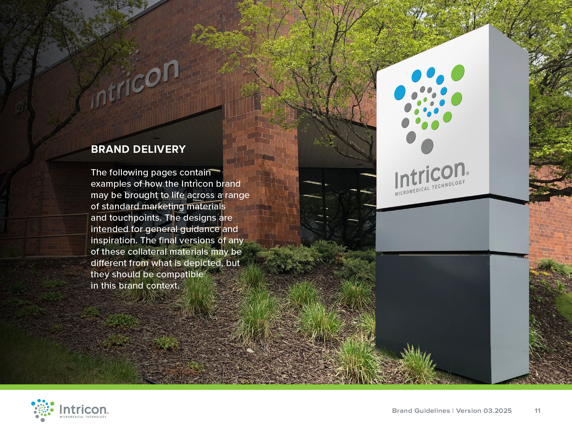
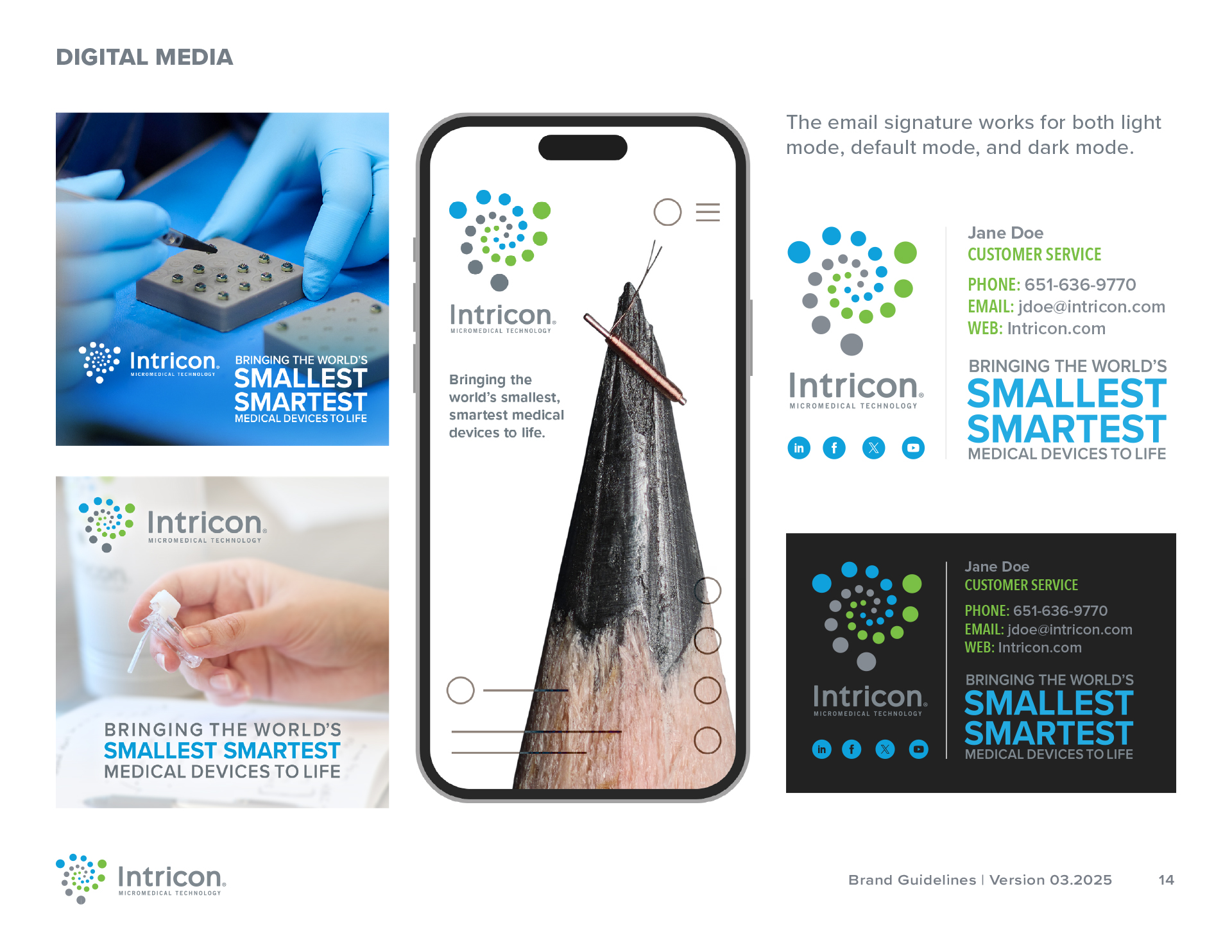
Brand Guide Sample

Website Redesign
Below is a preview of the website redesign. On the left is the old site, and on the right is the new site. Even though both showcase Intricon's technology, the new site gives it a sense of scale with hands being present in the image. The image is placed in circular frame to mirror the circular shapes in the logo. The new site also takes advantage of the contrast between the navy and green colors to help the other elements stand out.
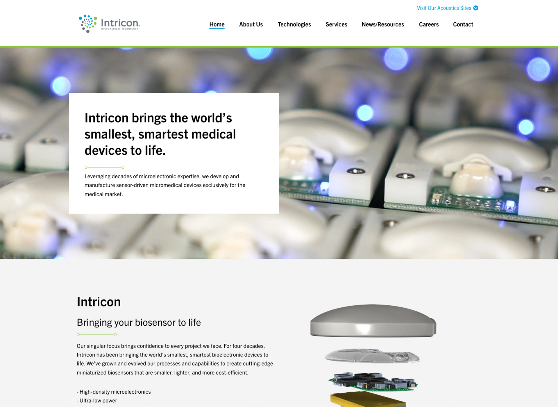

Image Treatment








Custom Icons

























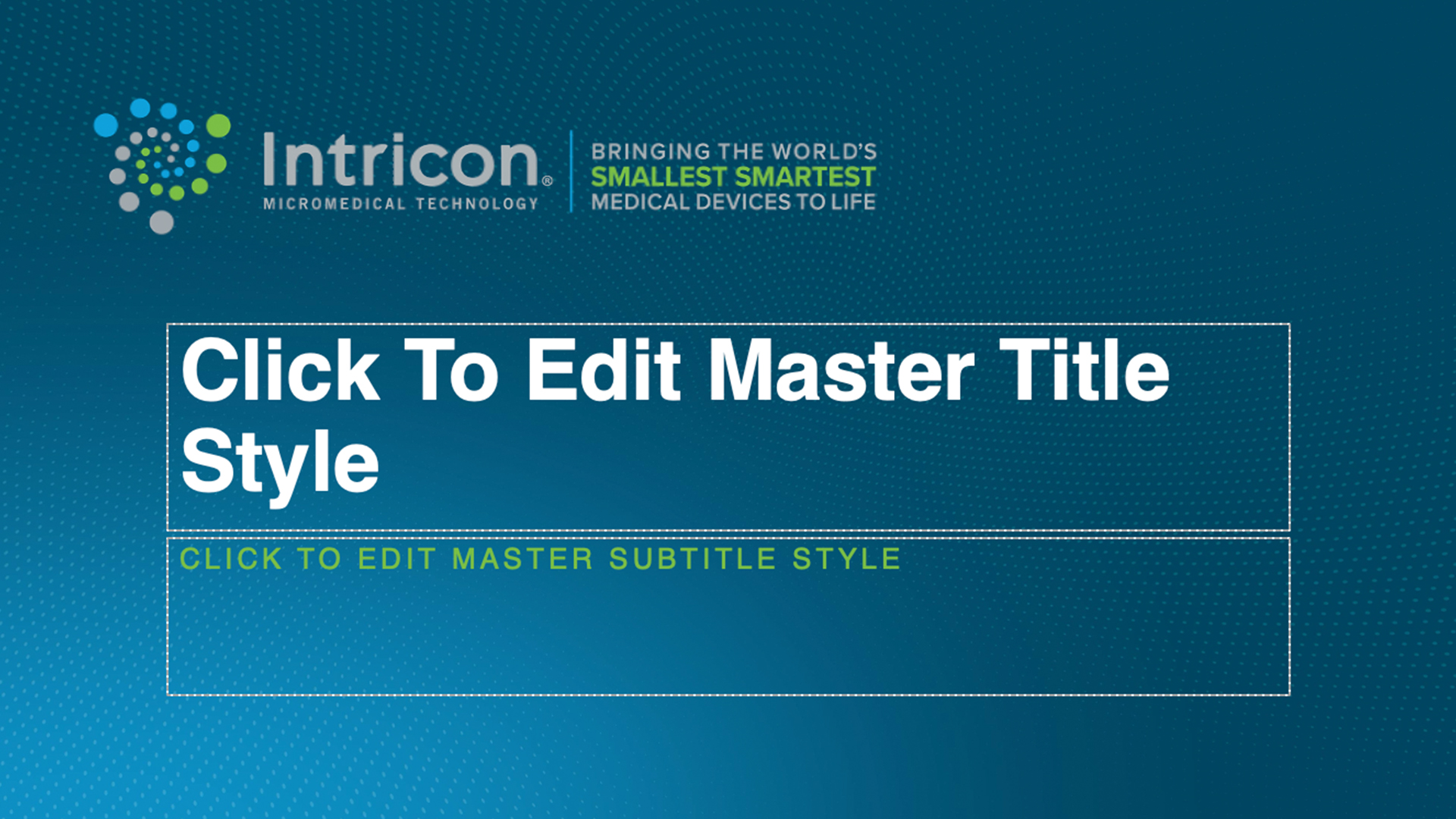
PowerPoint and Google Slides Template
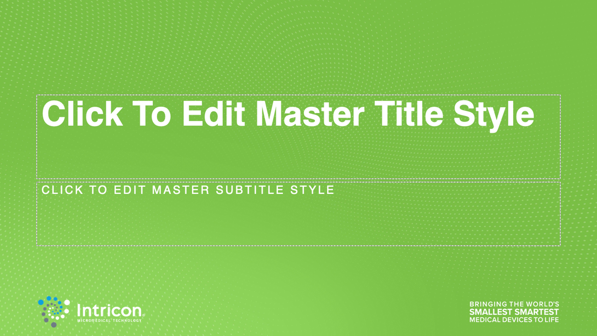
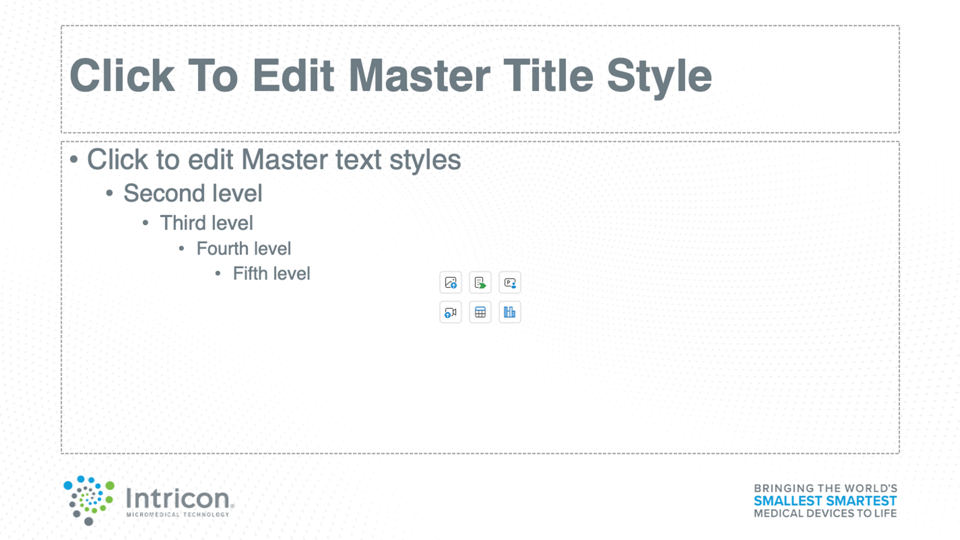
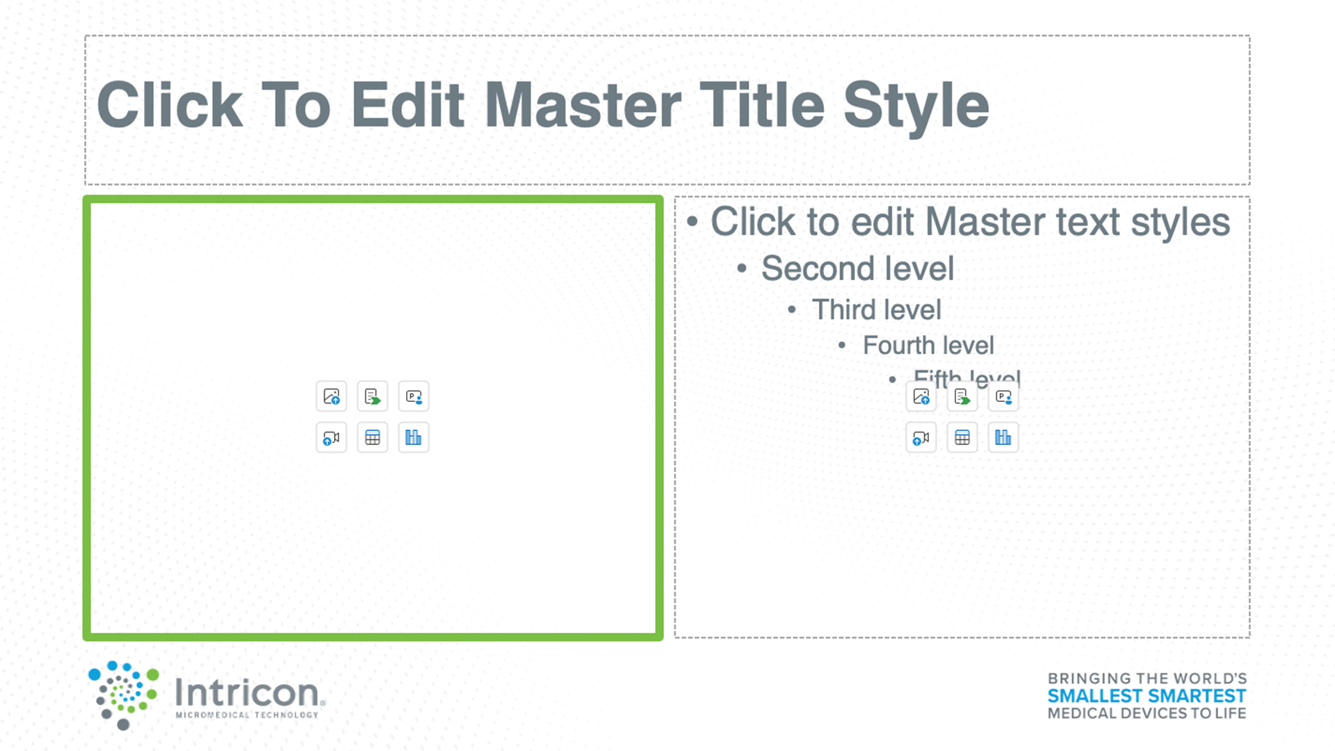
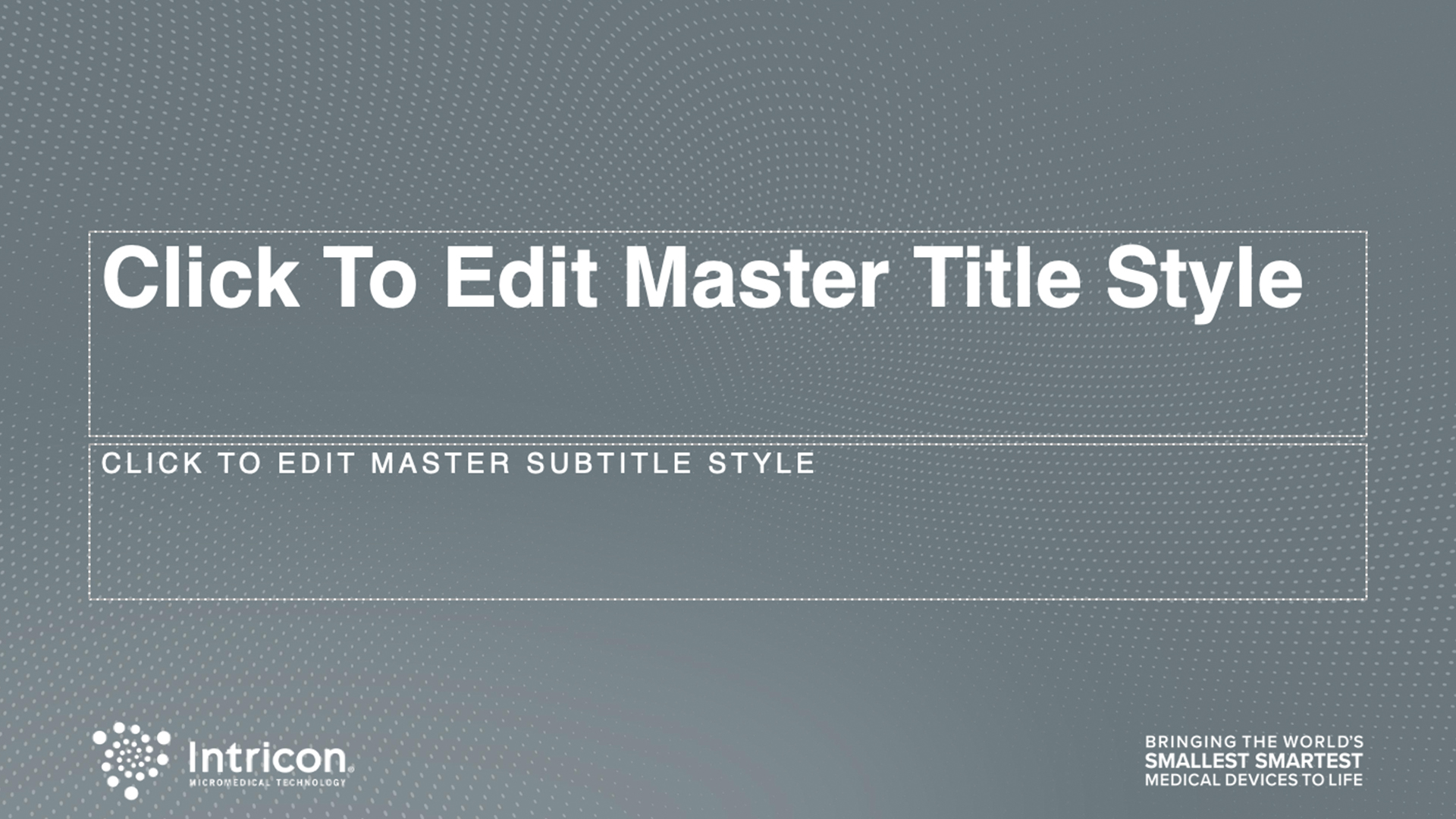
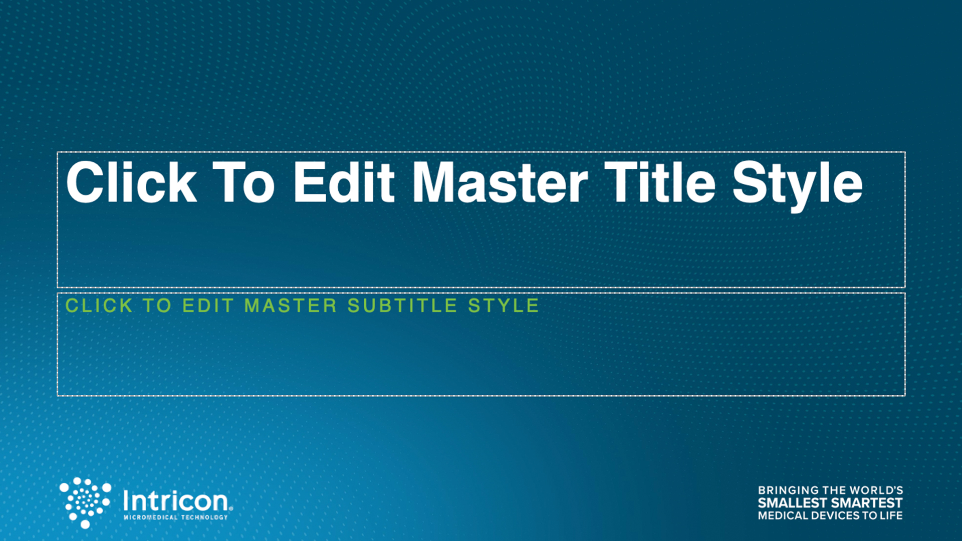
After designing the website and icons, I repeated the images and backgrounds to help create the slide template. What makes this different from the other digital assets is that background pattern of the small particles is more apparent. I used that to make the slides feel less visually static.
Print Design
The stationery and display banners, the last pieces of the refresh, are finally in line with the rest of the brand.